Redesigned and Rebranded a Mobile Party Game to 3x Engagement
Spotlightly
Endship
Figma


Context and Research
Competitive Analysis
Endship was designed to be a fun party game with friends who can playfully joke about each other. From a game design standpoint, there are 3 major features:
Creative: Players come up with their own responses.
Humorous: The content is inherently funny, due to how the game is set up.
Personalized: Content is about players, not just other topics.


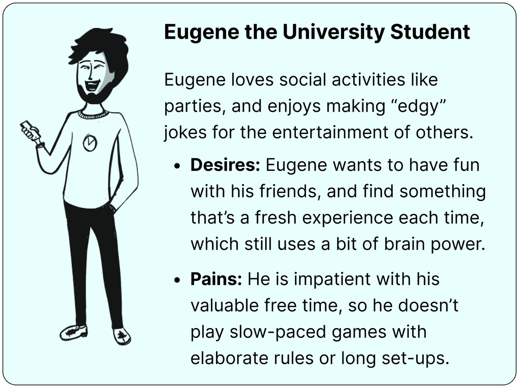
User Research and Proto-Personas
Through hundreds of rounds observed by the original game developer, and several post-gameplay interviews, I came up with two proto-personas representing the main user types.


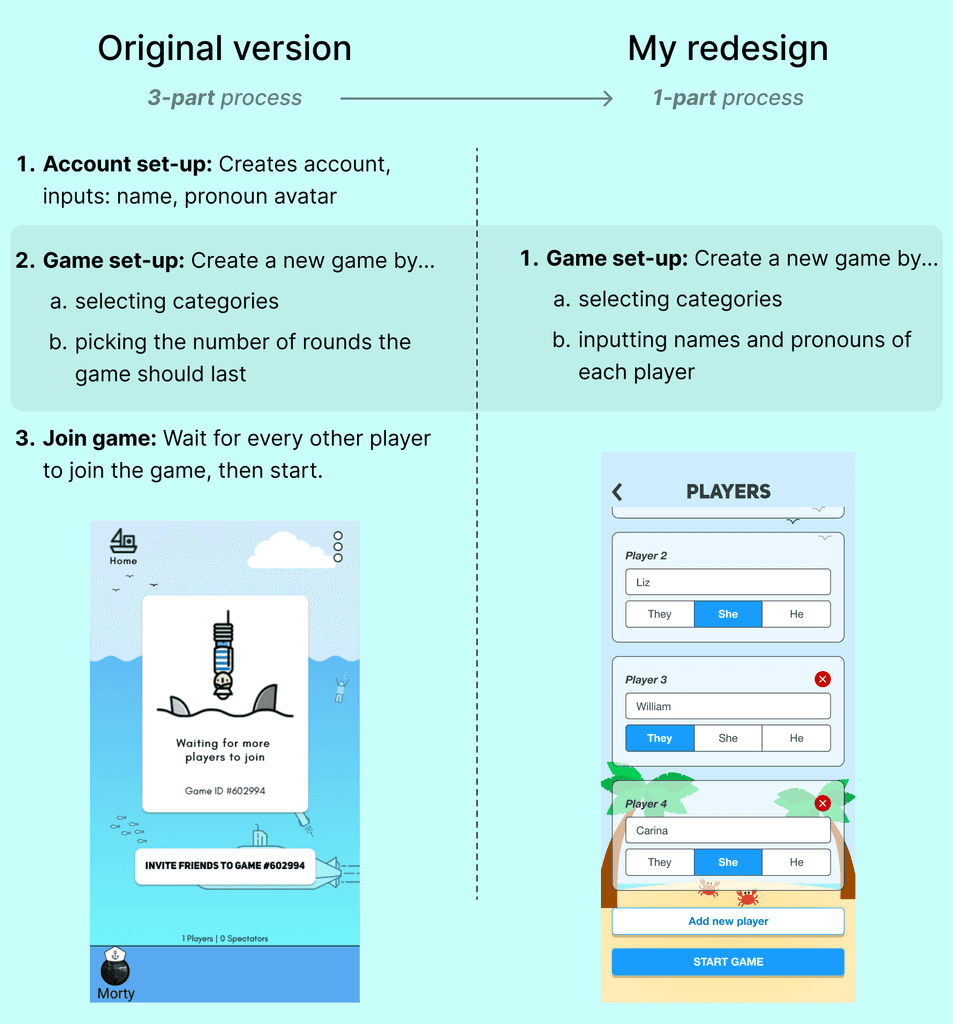
Why Endship (v1) Needed a Redesign
Endship initially entailed creating a game room that others joined online. Each round, they’d all write answers, and select their favorite responses.
This multi-device UX was the original vision of Endship, but my research indicated some unexpected limitations, including:
1. Logistics
Playtime was often limited due to someone in the group having low batteries.
2. Friction
Everyone needed to download the app, create a new account, join a room, etc.
3. Timing
Since players read responses on their own devices, the fun “answer reveal” wasn't such a social experience.
Redesign and Rebrand
Starting the Rebrand with Categories
The foundation of the redesign came from visualizing the game categories as decks from a card game, with simple monochromatic illustrations.

Designing a New Look
I fleshed out a new brand identity by replacing the “submarine” motif with a “pirate ship” theme, while maintaining its quirky charm.
I took this solid-color aesthetic and redesigned the landing page and mobile app with it.

UX and UI Redesign
Starting a New Game
The new UX offloads the game set-up to one person. Since there's usually one eager player to introduce the game to friends, this UX facilitates word of mouth.
Completing a Round
By using progressive disclosure (showing only what’s necessary when it’s necessary), each step per round is simple and intuitive.


Game modes
Two Ways of Playing
Shouting mode: A lively mode where the captain (the player whose turn it is) gives points as people roast them, by shouting their responses
Writing mode: Where players have a minute to write their answer offline (eg. with pen and paper)

Toasts: "Safe mode"
Toasts — a variation of "roasts" where players are set up for compliments — is effectively the way to play when you want to ensure no one's feelings are hurt.

Key takeaways
Never ignore the context of use: The original game was designed with playing at home in mind, where people could charge their mobile devices anytime; but this was usually not the case. And when even one person had low batteries, most groups stopped playing rather than excluding them.
Don’t just reinvent the wheel: While the “shouting mode” creates a lively fast-paced experience, we didn’t want to get rid of the “write for a minute, vote at the end” UX, which is a familiar game design pattern. The solution was simply to make two game modes, and let players pick.
The importance of colors and backgrounds: Picking colors was surprisingly difficult because of how many were needed (eg. over a dozen deck designs). But I found that keeping a solid color (sky blue) as a background not only elevated the design, but made it significantly easier to work with, compared to the gradient from the initial version of the game.