Led Cross-Functional Development of Resource Management Tool
Approx. 12 months (including time waiting for user feedback)
Lead Product Designer, UX Researcher
Figma, Miro, Zendesk, Pendo, Aha!
Context
Overview
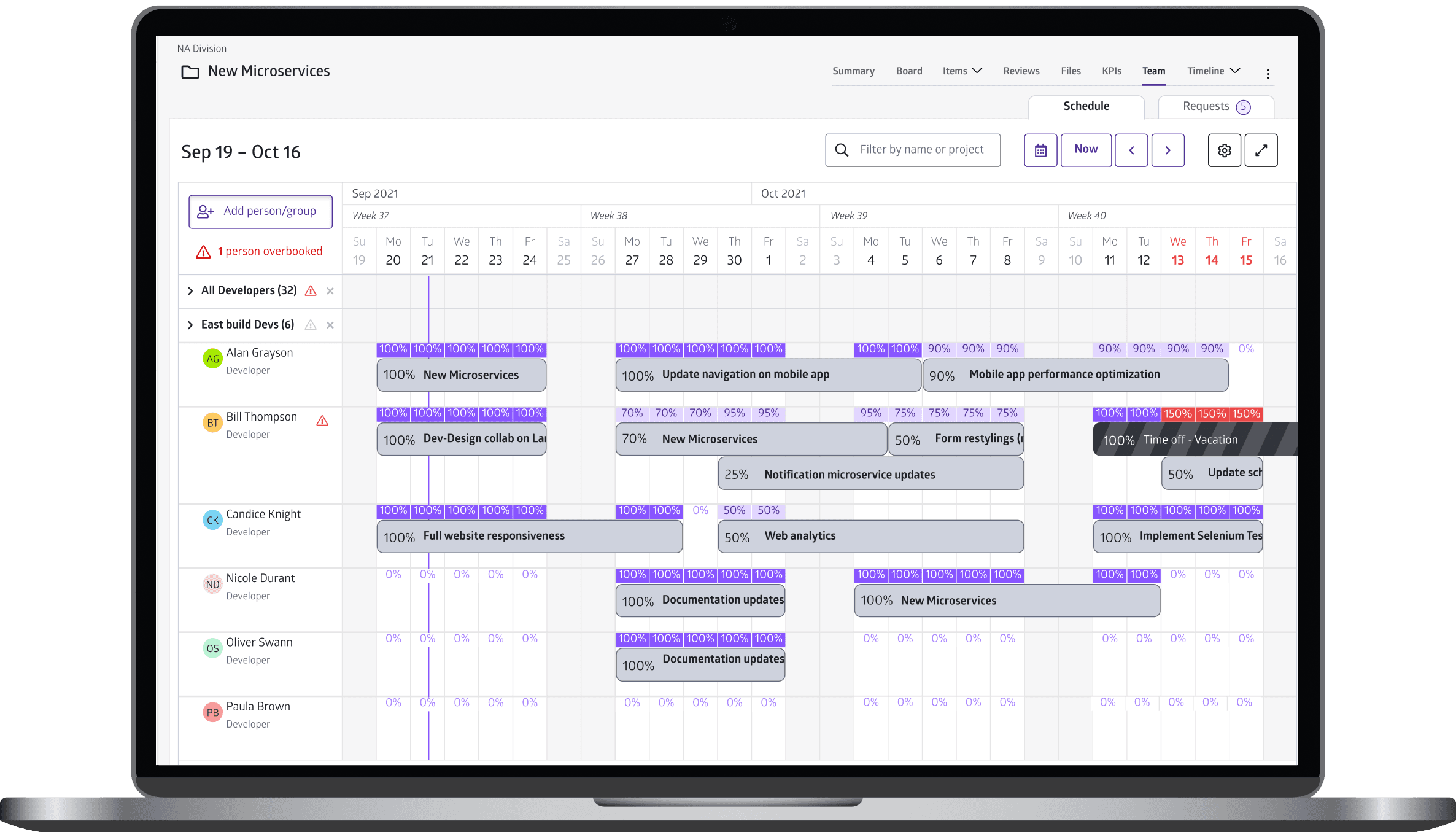
Problem: Users struggled with inefficient resource management capabilities, and need to be able to balance workloads, resolve overbookings, and plan ahead.
My role: I was the sole designer and researcher, working end-to-end with the Product Management and Engineering teams to develop and iterate rapidly.
Lean UX
To ensure alignment across teams and faster design implementation, I used Lean UX, characterized by these key principles:
Speed over perfection: We knew we wouldn't get it right the first time, so we iterate based on user feedback.
Experience over deliverables: We didn't care about a features quota — we focused on solving user pain points.
Collaboration over silos: Rather than sequential hand-offs, we involved each other in our workflows, reducing errors and excessive documentation.
User Personas
Client interviews led me to identify three key personas:
Planners: Resource managers and team leads who need to allocate work, resolve overbookings, and optimize schedules.
Requestors: Department heads/leaders who need the ability to request scheduling/allocation changes.
Workers: Team members who merely view schedules, and can submit time-off requests on their own.
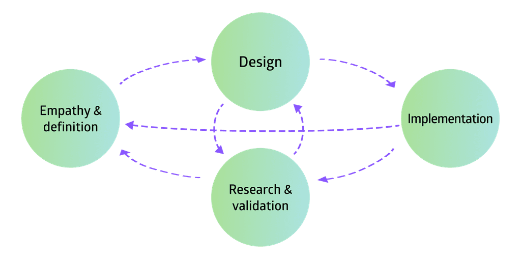
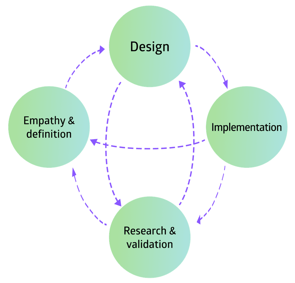
Process and Methods
Empathy & Definition
Conducted interviews with key users to define pain points and goals; discussed user needs and personas to ensure cross-functional alignment
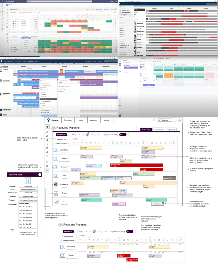
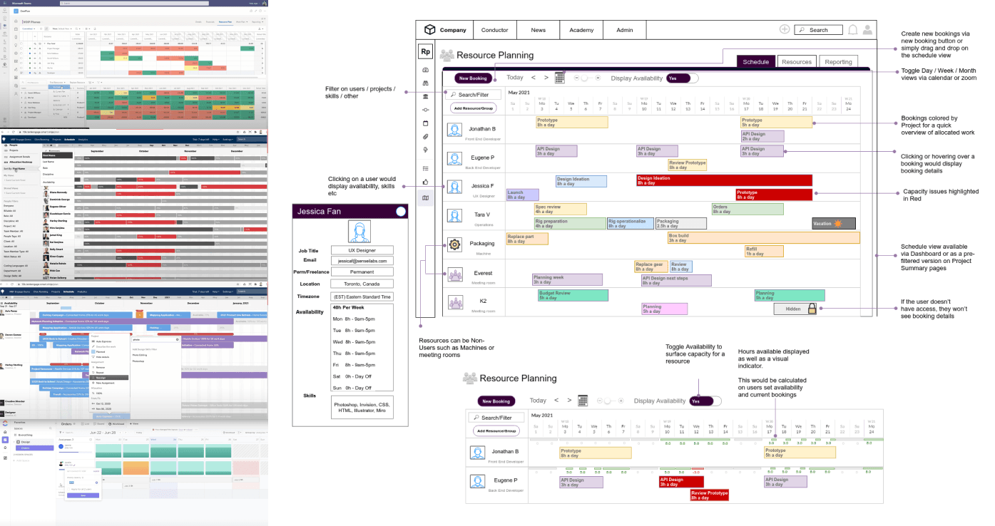
Partnered with Product Manager to collaborate on wireframes in Miro, and identified key workflows (e.g., allocating work, resolving overbookings, etc.)
Design
Created various design solutions; discussed optionality and feasibility with Engineering thoroughly
Designed and refined interactive prototypes in Figma, based on user feedback
Research & Validation
Active research: Conducted usability tests, and monthly client meetings/interviews.
Passive insights: Monitored analytics (via Pendo) and reviewed customer support tickets (via Zendesk).
Implementation
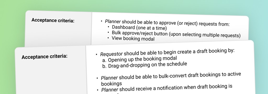
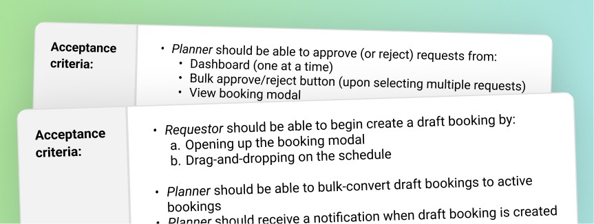
Wrote acceptance criteria (via Aha!) and supported team through development
Created rapid design prototypes whenever whenever unexpected problems arose (e.g., limitations in JavaScript libraries)
Design Evolution
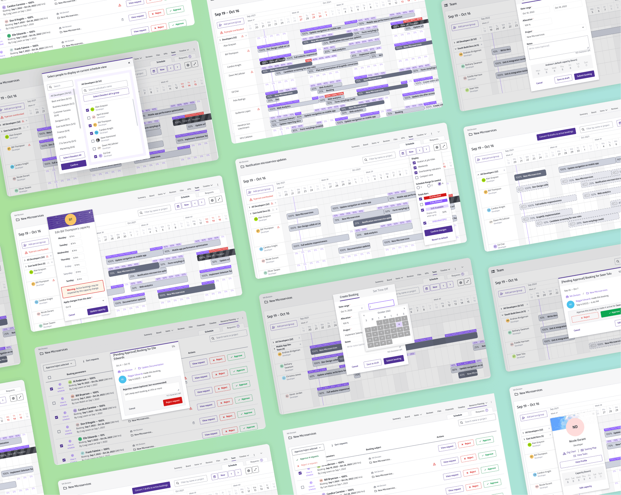
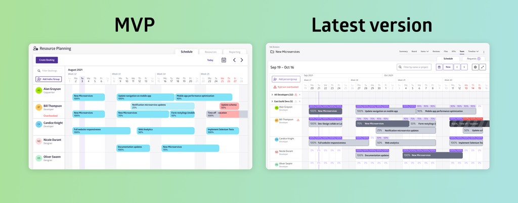
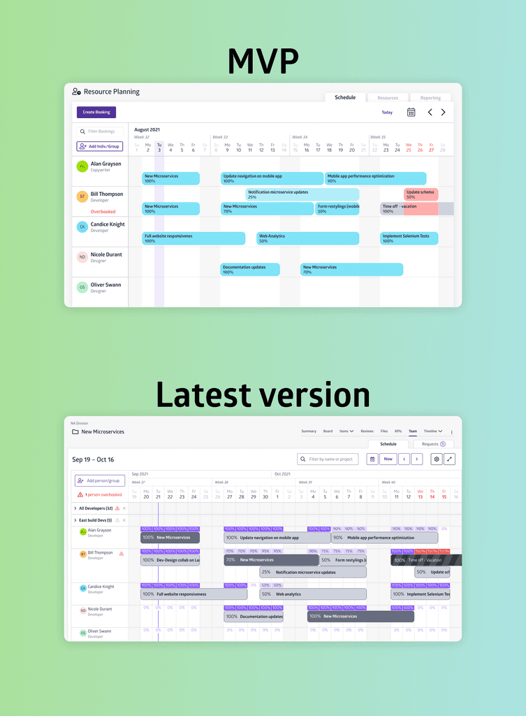
This visual snapshot — using virtually the same data — shows how much the MVP changed between 2021 and 2022 (while including the navigation bar).
MVP (2021): Focused on resolving overbookings but lacked tools to maximize resource capacity.
Latest version (Q4—2022): Iterative updates introduced workflows for draft schedules and approvals, capacity management, permissions, etc.
Design Solutions
While there were dozens of features and small iterations, here are some of the key features that I designed to help our clients.
1. Resource Utilization Bars — for balancing work
Problem: Planners needed to identify workers who don’t have 100% allocation — and either allocate more work, or take excess work off their plate and reallocate it.
Solution: Colour-coded “utilization bars” were designed to indicate if someone had availability (i.e., light purple) or were overbooked (i.e., red).
Design Rationale: Colours for utilization bars (and their ability to toggle) enables users to determine availability without even reading the bookings.
Resource utilization bars: Toggling bars to quickly find what you need.
2. Draft Schedules and Warnings — for minimizing risk
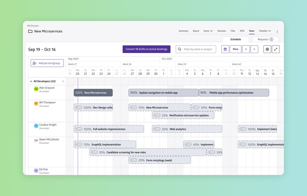
Problem: Planners need flexibility to create, save, and revise schedules without committing changes prematurely.
Solution: I designed a drafting mechanism to enable Planners to plan schedules before finalizing decisions. I also ensured that overbookings require confirmation first, and warnings remain until they're resolved.
Design Rationale: I made sure to introduce friction to prevent accidental overbookings, without actually restricting users' actions.
Drafts: Creating draft bookings before making them active
Warnings: Overbooking resources causes persistent warnings
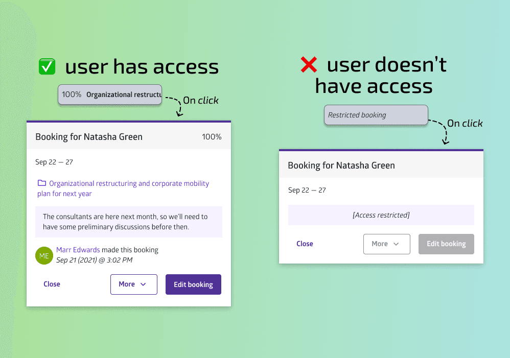
3. Approval System and Access Restrictions — for security
Problem: Planners needed oversight of all proposed schedule changes, and access restrictions to protect sensitive/confidential information.
Solutions:
Approval System: Enabled requestors to propose changes for Planners to approve/reject.
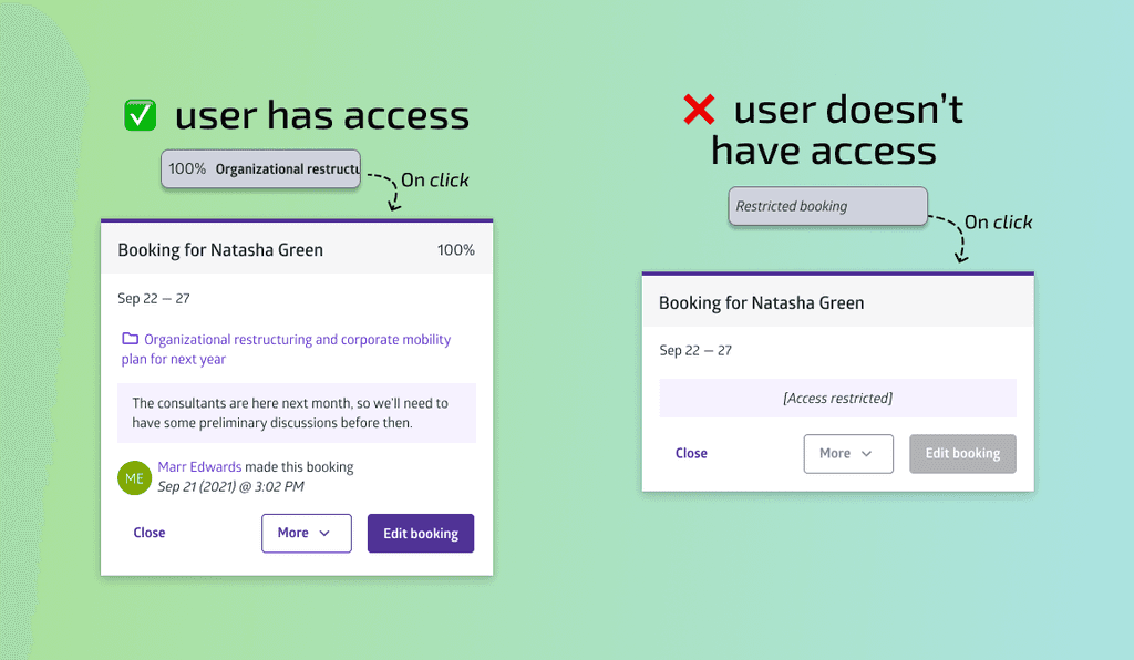
Access Restrictions: Leveraged existing platform permissions to ensure only authorized users can access confidential data.
Design Rationale:
Approval System: Requiring Planner approval ensures any schedule changes align with priorities and prevent costly errors.
Access Restrictions: Leveraging existing tech is much more efficient than building a new system.
Bulk approvals: Approving multiple requests for changes in schedule
Permissions: Only users with access can view sensitive project details.
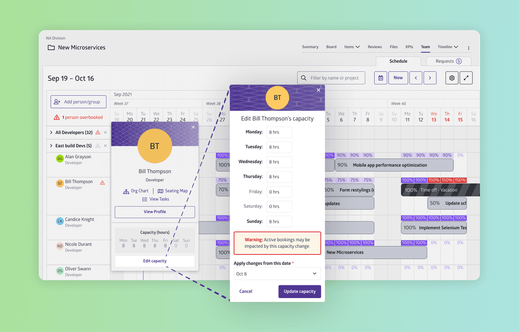
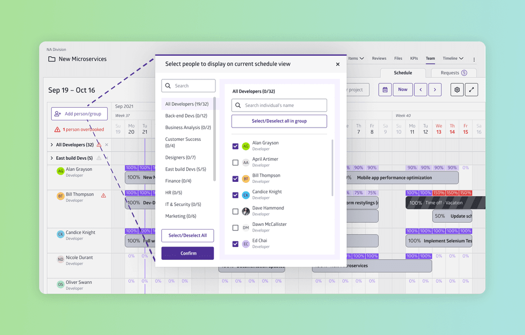
4. Capacity Management and Custom Views — for flexibility
Problem: Planners needed to adjust workers’ capacities and the flexibility to customize their working schedule views to fit their preferences/needs.
Solution: I designed a variety of ways to customize the UI, including:
Individual capacity management (e.g., for non-standard work hours)
Add/hide people or teams from your current schedule view
Project-scoped vs. “global” view (e.g., to see Project assignees vs. cross-department comparisons)
Other UI customization options
Toggling compact view on/off
Individual capacity management
Resource selection modal
Future Plans
I last contributed to Team in Q4-2022, but future improvements could include:
Long-term scheduling views: Expand the schedule display to cover 6+ months, enabling better strategic planning.
AI-assisted scheduling: Automate draft schedules using AI to analyze patterns, saving Planners time and minimizing human error.
Advanced reporting dashboards: Add team and individual performance insights to help clients optimize their resource allocation.
Key takeaways
Here are the main things I learnt from this project:
Collaborate more for short-term pain & long-term gain:
Close cross-functional collaboration takes time and effort. But in the end, implementation is much more efficient because of everyone’s shared understanding and involvement.Small decisions have ripple effects:
Since this product was so interconnected with other areas of the larger platform, I found that many seemingly small decisions actually had major implications for the UX of the product.Adaptability beats a good plan:
By re-evaluating the requirements and solutions over multiple iterations, we were able to adapt to changing priorities and feedback, resulting in a product that met both current user needs and potential future demands.
