Delivered e-Store Redesign to Break into B2C Market, in just 3 Months
SKF
2020 (Q2-Q3)
Sole designer & researcher
Figma, Whimsical, Procreate
Research
Since SKF didn’t know about their target users, I conducted extensive user research, using both qualitative and quantitative methods.
Quantitative: Website analytics (previous 3 months), user surveys (completed by 166 participants)
Qualitative: Competitive analysis, user interviews, desk research (eg. industry reports, news stories, and research articles), website UX audit, stakeholder workshop to ensure we’re aligned on solving the “right” problems
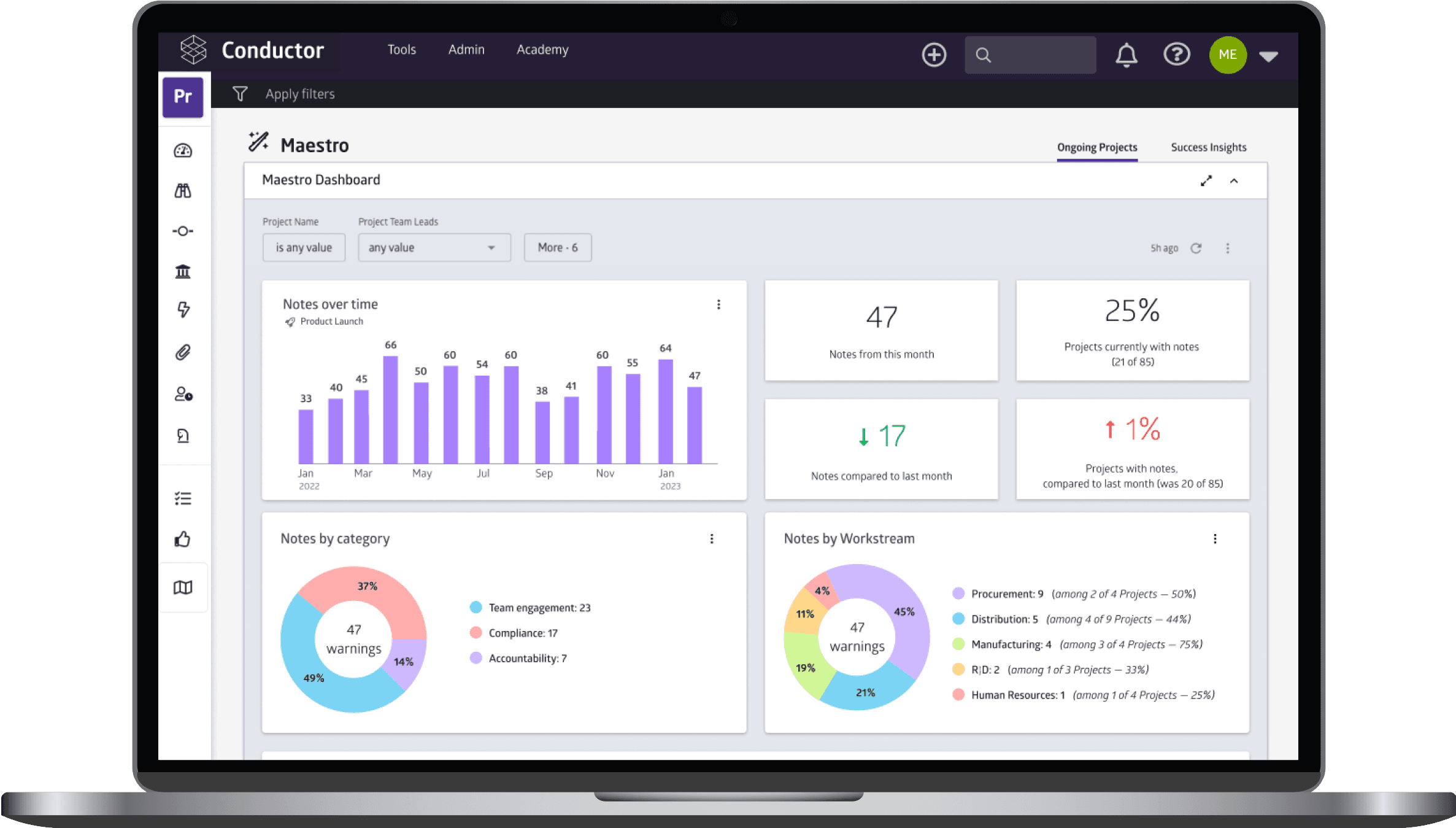
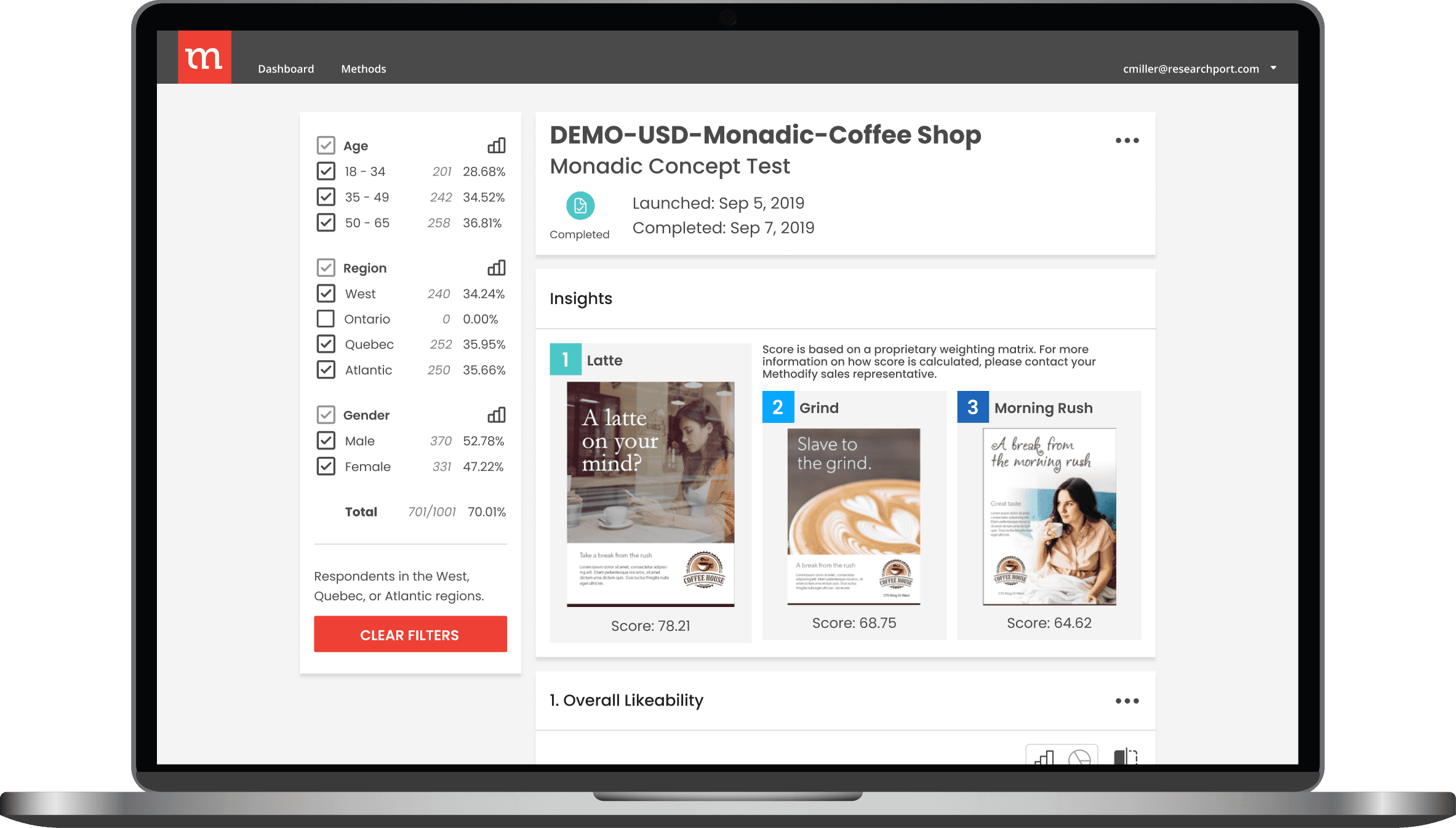
Competitors, analytics, and workshop notes
This research enabled me to create three user personas, as well as a user journey map for the primary persona.
Design
My Process
My general design process went as follows:
UX audit: Audited the site to identify problems & opportunities
Sketches: Explored design solutions with quick sketches
Wireframes: Fleshed out several user flows with more detailed wireframes
I presented them to users, and iterated according to their feedback
High-fidelity prototype: Designed solutions in a high-fidelity prototype
Redesigns
While there are dozens of screens to show, here are the most notable redesigns.
Homepage
Improvements include:
Actionability: Better visual hierarchy (leading to purchases); showcased the training program with gamification to encourage engagement
Aesthetics: Minimalistic look, with greater emphasis on premium quality
Personalization: Show personalized deals and recommendations, based on past behavior and vehicle ownership.
Relevance: Eliminated links to old articles or videos, and replaced them with recent blog articles and relevant social media content.
Product Page
Research indicated DIY users want to buy and learn in the same place, so my redesign incorporated this with navigation that serves as a table of contents.
Category Page
The content on this page had a confusing 2-column format that made it hard to read. Now, a sidebar shows content while enabling convenient navigation.
Search Page
The search functionality was confusing, especially for DIY’ers. I streamlined the filtering and vehicle selection process without wasting so much real estate.
Product Listing Page(s)
I took the redundancies of the original page and split it up into a few pages, making the experience substantially more efficient and user-friendly.
Designing for DIY’ers
I made it easier to access the educational content throughout the site, and designed new features to help people learn and make purchasing decisions.
Key takeaways
Here are the main things I learnt from this project:
Thorough research makes up for an initial lack of industry knowledge
I initially knew very little about the auto industry, and SKF had no knowledge to give me about the DIY market they wanted to enter. But I managed to complete this project due to my extensive research."Mobile-first" forces decisions
Limiting the visual real estate by designing for mobile devices forces you to make major design decisions, which made it easier to design for desktop afterwards.Realistic user personas are the holy grail of user research
This is the only project (in my entire career) where I actually found someone who was almost perfectly defined by the primary user persona I made. The uncanny similarities made his feedback incredibly relevant and useful.


