Built Design System to 3x Design Efficiency and Improve Collaboration
Sensei Labs
4 years (two years for Phase 1 & 2; two years for Phase 3)
Figma, Miro, Pendo, Aha!, Zendesk


Phase 1: Creating the Foundations
I joined Sensei Labs as a Senior Product Designer to build enterprise-grade features and simplify platform complexity; but I quickly noticed inconsistent design patterns and fragmented workflows were limiting our team's (and product’s) potential. Therefore, I focused on:
Delivering new features to meet immediate user needs
Building a scalable design system to improve efficiency and consistency.
By collaborating with the team to define shared design rules and components, I gradually formalized a unified system. This foundational investment streamlined future designs and positioned the team for long-term scalability.
UX Research: Understanding the Landscape
User Research
Early on, the team ran cross-functional workshops to flesh out user personas and journey maps, helping us synthesize key pain points and user journeys.


These workshops provided a foundation for understanding user needs. However, I found that feature-scoped personas became more effective for designing modular components in the system.
For example, on the KPI’s page of the platform, we tailored solutions to:
Project Leads – Needed more efficiency with repetitive manual data entry.
Directors – Needs cross-workstream dashboards for high-level insights.
These personas weren't universal, as user needs varied across the platform.
Ongoing customer feedback
To ensure continuous improvement, I also gathered insights by:
Tracking in-app behavior (clicks and time-on-page) via Pendo
Tracking support tickets from our customer request portal, via Zendesk
Reviewing client feedback videos in bi-weekly internal meetings, via Gong
Collaborating with clients in Product Advisory Council (PAC) meetings to refine roadmaps, user needs, and prototypes
Cross-platform consistency
Without a design system in place, consistency was challenging. For example, there were multiple versions of the same component, which caused confusion whenever implementing them.
My redesigns improved user efficiency and reduced errors in the design workflow, making development handoffs much smoother. The design system was largely formed by such redesigns.


In fact, every feature I worked on contributed to the design system’s evolution, resulting in a cohesive interface across the platform. For example:

Maestro: An automated warning system

KPI Explorer: Granular data inspector

Board: Our version of a kanban board.

Risk-Return Matrix: Our version of an Eisenhower Matrix
Design System Beginnings
Through these early efforts, I laid the groundwork for the design system by consolidating a component library and establishing content guidelines. This foundational work was an investment in scalability, enabling our team to design faster and more consistently in the future.

Phase 2: Leading and Scaling
The early part of 2022 marked a significant turning point, as I was promoted to Lead Product Designer, aligning with important organizational changes:
Company-wide adoption of a 4-day workweek
Transition to a smaller, more agile design team
Leadership changes that redefined work culture
Despite fewer resources and tighter deadlines, the design system investments from Phase 1 began to pay off. These foundations enabled me to maintain the high design output, and even lead cross-functional projects, including the notifications redesign detailed below.
Project Atlas: Notifications Redesign
One large project I led was the redesign of the notifications system (primarily for email), which required robust research and collaboration between five teams.
This redesign saved dozens of hours monthly for our support team, by offloading email customizations to users. It was a win-win: users embraced the self-service UX, while we reduced operational overhead.

A snapshot of the data for 3000+ notifications (colourized for readability)

Comparing the same exact email content, before and after my redesign

Weekly Progress Report template

Weekly Activity Summary template (via Outlook)
Beyond UI Design
The benefits of the design system could even be felt outside the scope of our platform’s UI, because I was able to write/design things for other teams, including:
help center articles, to exemplify content guidelines and use as a model
PowerPoint pitch decks, for meetings with external stakeholders
content guidelines, for common problematic in-app copy
company wiki articles, for knowledge management
various posters/graphics, for customer education
These initiatives streamlined internal knowledge sharing and improved external stakeholder engagement.

Help center article (all content my own)

PowerPoint pitch deck

Poster to educate on a newly released feature
Accelerated Delivery
In Phase 1, feature delivery was often delayed by 1–2 weeks due to extensive planning meetings and QA protocols. By Phase 2, we reduced this delay by around least a week, thanks to:
Leveraging the design system to eliminate redundant iterations
Increased asynchronous communication to resolve issues in real time
Streamlining design workflows for smoother handoffs between teams
Phase 3: Designing for Business Growth
As of 2023, this phase reflects the design system’s maturity, enabling the team to maintain consistent, high-quality designs without my day-to-day oversight. After transitioning to a contractor role to pursue entrepreneurial goals, I’ve focused on high-stakes prototypes that address client needs, showcase innovative solutions, and support the company’s business growth.
Below are three recent examples:
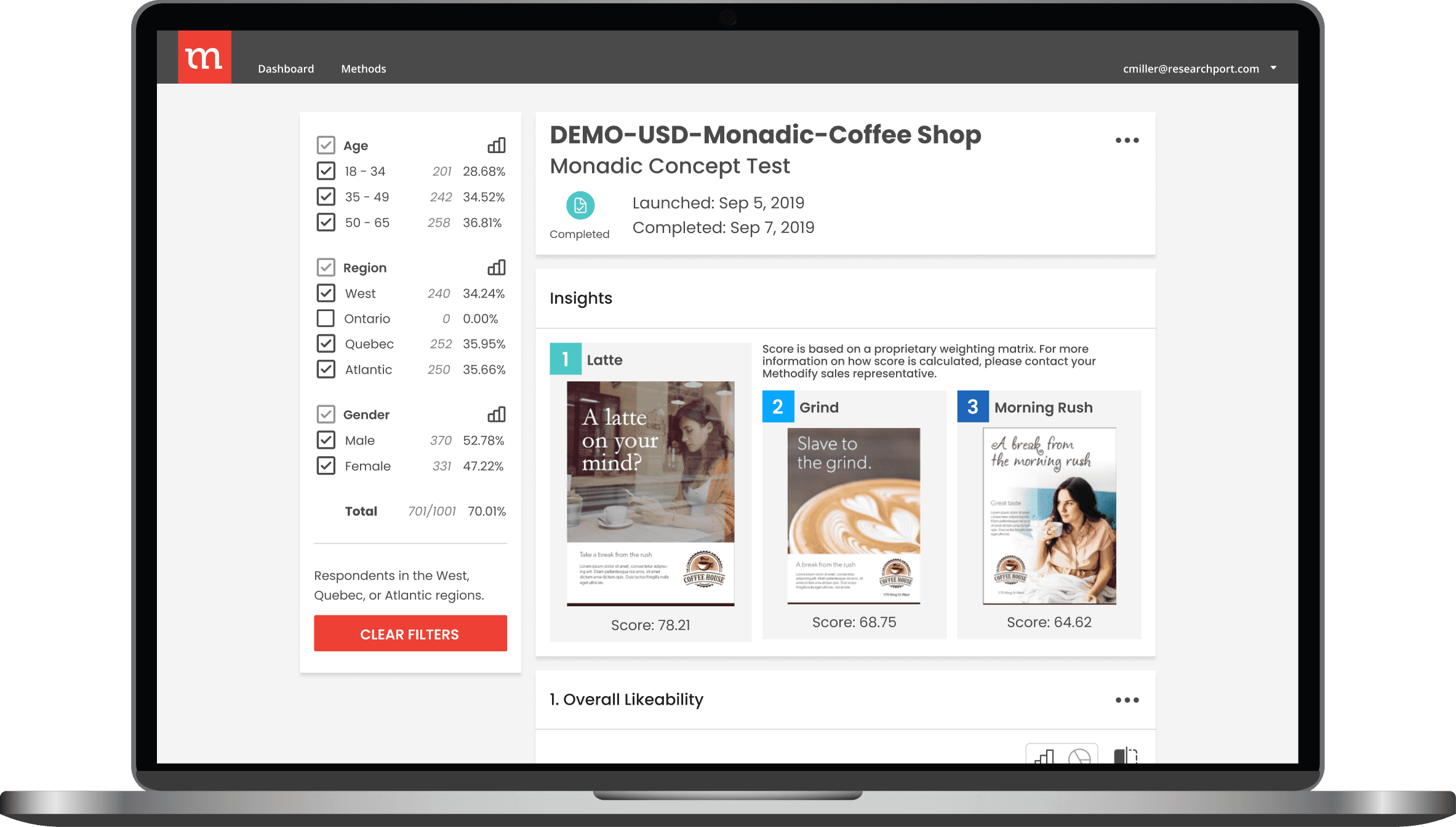
Strategic Planning: To build plans, compare them, and action on the best.
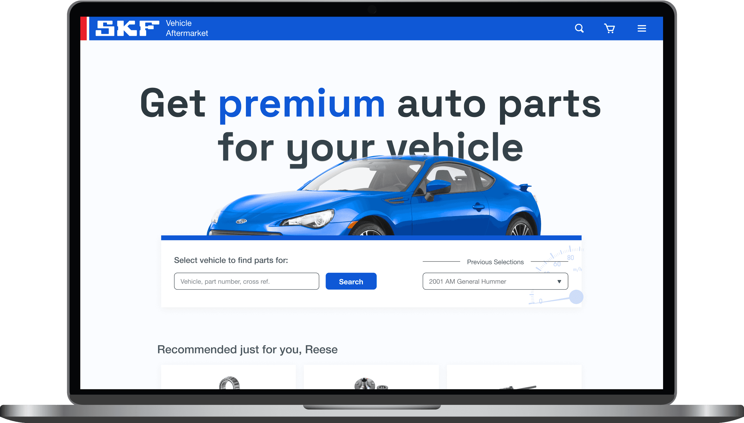
Third-party Integrations: Showing external data
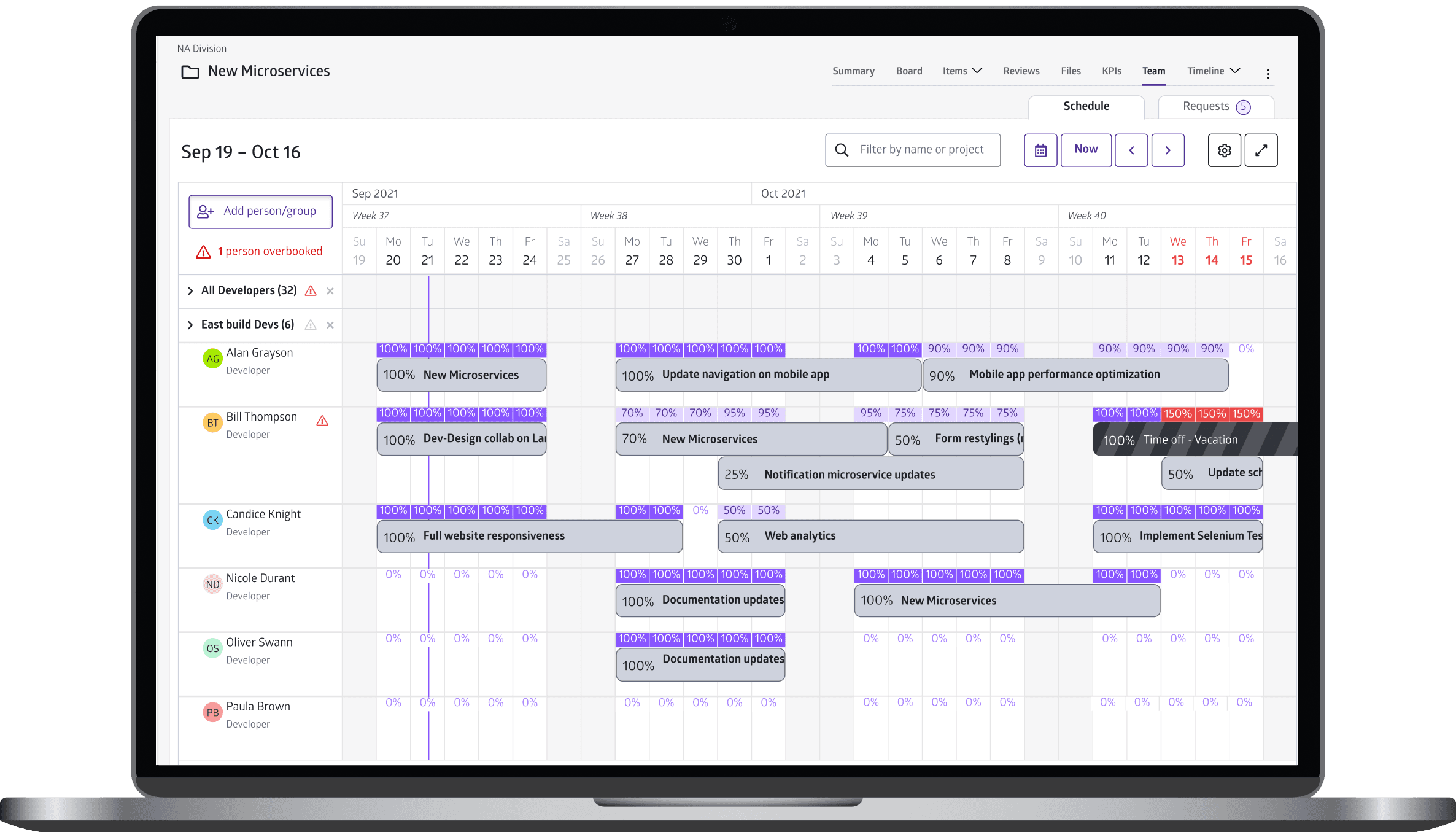
Personalizing Navigation: Optimizing workflows
Key Takeaways
Efficiency is a team effort, not a solo pursuit: Individual contributions only go so far. Creating scalable impact requires aligning cross-functional teams, and streamlining workflows to focus on what truly drives results.
Culture shapes productivity and innovation: Reducing red tape and adopting asynchronous communication made our team leaner and more efficient, while also enabling us to create a better product.
Building a design system is grueling work—but transformative: As the sole designer collaborating with multiple dev teams, creating and managing the system was a monumental challenge. It required aligning priorities, thorough documentation, and internal education to enforce consistency. Ultimately, it delivered a scalable foundation that enabled faster shipping.